Monday, April 30, 2012

Brochure front edits.

The front of my brochure in the previous post is seen below.


After receiving feedback that the front of my brochure was too stagnant, I made some variations to make it more dynamic and eye-catching. The following are my attempts at this.
The white stripe is there in relationship with the next page, where a white divider comes into the page from that direction. I ultimately decided to rule it out in favor of making the cover itself stronger.


Friday, April 27, 2012

Governor's School informative brochure.

When the topic of a brochure was discussed, it didn't make much sense considering the focus we've had so far on grassroots advocacy. Brochures are more difficult to distribute, they aren't easily sharable, and getting people to act with a brochure somehow seems a lot more difficult to do than via a poster, flyer, or website. So after some deliberation, it was decided that, seeing as one has not yet been created, an informative brochure about what Governor's School actually is and what sets it apart was the best choice for this project. I started to brainstorm economic, yet atypical layout formats.


After a decent amount of research of similar brochures and about Governor's School and how it presents itself, I started revising digital roughs in InDesign. I arrived at a graphic solution I particularly liked, and you can see that developed below. This solution is 4"x5" when fully closed, and 12"x5" when fully opened, so two can fit on one 11"x17" tabloid size sheet. The brochure's edges fold in and then it folds in half again to fully close. The center spread is what it would look like when halfway opened.

50th Anniversary webpage.

The foundation requested a revamp of their webpage for the 50th anniversary event they're throwing on July 14th. The text scales into very narrow columns on small screen sizes, and they wanted something more like how I handled scaling on the saveNCGS! site with a similar appearance. I dumped the color scheme of the old one to favor a more elegant and subtle scale of light greys and orange/gold. The page can be viewed here.

Wednesday, April 18, 2012

Governor's School 50th Anniversary logos.

After asking about further needs of GSF, I was told that there was a need to give an identity to the anniversary event celebrating Governor's School's 50 years of being.

I started by looking up logos of other organizations' 50th anniversaries.


After some research looking into the symbology of the number 50, I decided that there was a great power in the number and its associations, and I wanted to reflect that power elegantly. Fifty years is a long time and that age mark comes with connotations of experience, strength, and endurance.


In order to better understand how I could reflect those traits in two numerals, I played around with different styles of typefaces:


After looking at the variation I generated, I suddenly knew that I wanted to go with a classic choice.
I took oldstyle numerals from Caslon and Jenson and combined their forms for the 5, making something both sturdy and energetic. The 0 is simply Caslon.

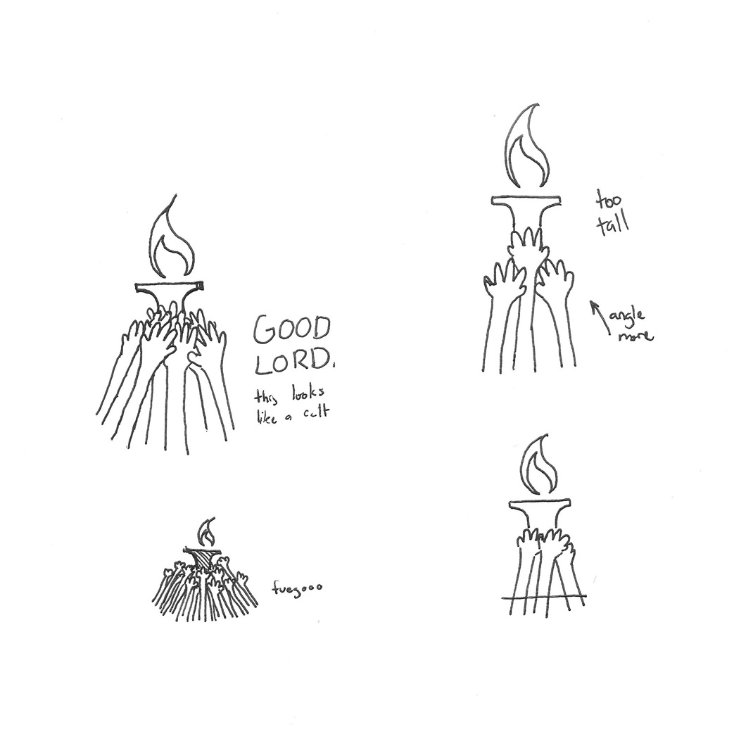
To further activate the form, I added the trademark Governor's School flame to the 0. Like I've mentioned before, I really feel like this flame is a unique representation for GS as an organization, through both perceived concept and form. It also tends to spring into action along with the 5, complementing it nicely.
I experimented with this relationship below.


I then took my favorite combinations and paired them with NCGS text, set in Minion. This may not be part of the final logo- I just tried to understand how to place the text with the image of the 50.


Further refinement.

Friday, April 13, 2012

Poster finals.

After getting some feedback from Roice, I decided to go with the third design and add a warmer hue to the alumni pictures to make it look more nostalgic and less stark against the orange of the flame.


I also made a 8.5"x11" .pdf version, which is easily printable by most people. I hope to make it available on the website so that Governor's School advocates can post it wherever they see fit.

Tuesday, April 10, 2012

Poster mockups.

After working a while with the ideas that acted as my starting point, I developed four very similar roughs.


Poster roughs.

I started to work on ideas for a poster.
I wanted it to have three things:
- a bold, central, attention-grabbing image
- minimal, yet important/informative type
- a clear web address and QR code


I focused on a gridded, Chuck Close-esque treatment of the background pictures, choosing to overload the imagery with a feeling of experience and variety in a positive and playful context.
Incorporating this image into the logo takes the aforementioned feeling and puts its positivity toward the cause of prolonging Governor's School and brings a community effort sort of overtone to it.

In refining this concept, placement was key. The crucial information also had to be factored in, not taking the forefront but still giving off an air of importance.
The following is me trying to resolve the placement of image and text.

Friday, April 6, 2012

Website launch!

Today marked the launch of the NCGS advocacy campaign!
The Governor's School Foundation site changed its visual language for the launch, as well as the GSF facebook page.

The completed site I've been working on can be viewed here.

It's adapts to screen size and is fully compatible with all new browsers and mobile devices.
(Was tested on Explorer, Firefox, Opera, Safari, Chrome, Rockmelt, iPhone, Android, iPad, and 3DS)

Tuesday, March 6, 2012

Website icons.

Icons for navigation and each section of the site were made, keeping in mind the brand of the logo I've chosen (pictured top left). All of the major icons involve hands in some way, and use the orange of the GS logo torch to stand out on the blues of the proposed website.
The buttons (bottom section) step away from the font choices involved in the rest of the web design in order to stand out more and match the bold nature of the rounded buttons.


EDIT: Buttons were revised to accommodate new content and just to look better in general, really.

Header exploration.

I messed around with different header combination revolving around the basic layout I decided on in the wireframe (last post). I thought the grid of faces brought a sense of ethos and personality to the header and had a higher possibility of establishing viewer relation more quickly. I decided to stick navigation on the right, mainly thinking about mobile accessibility.


I tried gray backgrounds under the assumption that the board would find it too dark...
But they weren't nearly as visually appealing.


I liked the following one the best, due to its ability to be contained in a 100% width-spanning div and scale down easily without requiring extra code or images.

Sunday, March 4, 2012

Website wireframes.

I started working on some wireframes that let me begin to understand how website content would work together visually. I decided on using a 1140css grid system, allowing me to design simultaneously for iPad and mobile, and using 10 of the 12 columns so that the page is not crowded when fullscreened.
There was a lot of information to include, and so it was sorted in sections based on relevance and importance that corresponded with GS's preexisting color palette.

Website planning.

While meeting with Roice around a week ago, we talked about components of the GS advocacy website, page contents, and visual language. I took horribly written notes on the page I used to sketch logo/text relationships.


I compiled them to be easier to read and used them as a basic rulesheet while doing my initial planning.


I then broke down the page structure and attempted to design icons for each section to promote easy visual navigation.


Logo revisions.

After sending off the last logo and receiving feedback from Roice and the GSF board, I learned that the logo I sent reminded too many people of anti-war posters and that the background was too harsh for a lot of people. The feedback I received was along the lines of:

"...put me in mind of some of the stark imagery used in the 50s and 60s to stir up sentiment for or against the Soviet Union."

"...it would help if it educated us a bit about the value of GS when we looked at it..."

"...once you get all those arms merged in together, it's hard to tell they were originally arms."

My answer to this was to return to my previous designs, make the human element of the hands more evident, and play around with different colors already in the Governor's School visual language.


Pairing text with the designs also helped to kill the stark nature of the original logos. I used a transitional serifed typeface to speak to GS's timelessness and mimic the typeforms in the original logo. Lowecase makes the word "save" accessible, while petite caps denote the importance of NCGS.


Sunday, February 26, 2012

Digital logo roughs.

I worked to create logos from my previous ideas and sketches in Illustrator, looking to arrive and something modular that could go with GS's preexisting branding yet still appear new and different.


I distilled these down to what I thought were the six strongest logos:


After more tweaking, I decided to go with this design- it is structured, strong, and the lack of centered imagery looks progressive.

Logoform ideation.

I began to brainstorm logos for GSF's Governor's School Advocacy approach, using a template that my peers used in Typography III last semester. It forces creation of imagery based on individual aspects, and combining these overarching symbols in as many ways as possible.


To start out, I isolated the words that I thought described Governor's School Foundation, distilled those down to three main themes, and then chose three more words for each of those themes. I added the letters that are significant to the organization to my chart as well, and then began to combine imagery.


After working on the larger chart, I decided that my results were too separate from the idea of advocacy, so I made a smaller chart with that focus.
From there, I remembered the Governor's School Alumni Association's slogan of "keep the torch burning", referencing the torch in the center of Governor's School's original logoform. Since torches are a graspable object and carrying a torch is (thanks to the Olympics) widely representative of continuing tradition, I thought this approach was worth a shot. (GS is turning 50 this year, consequently)
I chose to frame with either a square or circle, representing stability and continuity, respectively. Multiple hands remarked to a more impersonal, grassroots approach, breaking the space and drawing the viewer in. I wanted to create something that showed strength and community.