
To start out, I isolated the words that I thought described Governor's School Foundation, distilled those down to three main themes, and then chose three more words for each of those themes. I added the letters that are significant to the organization to my chart as well, and then began to combine imagery.


After working on the larger chart, I decided that my results were too separate from the idea of advocacy, so I made a smaller chart with that focus.
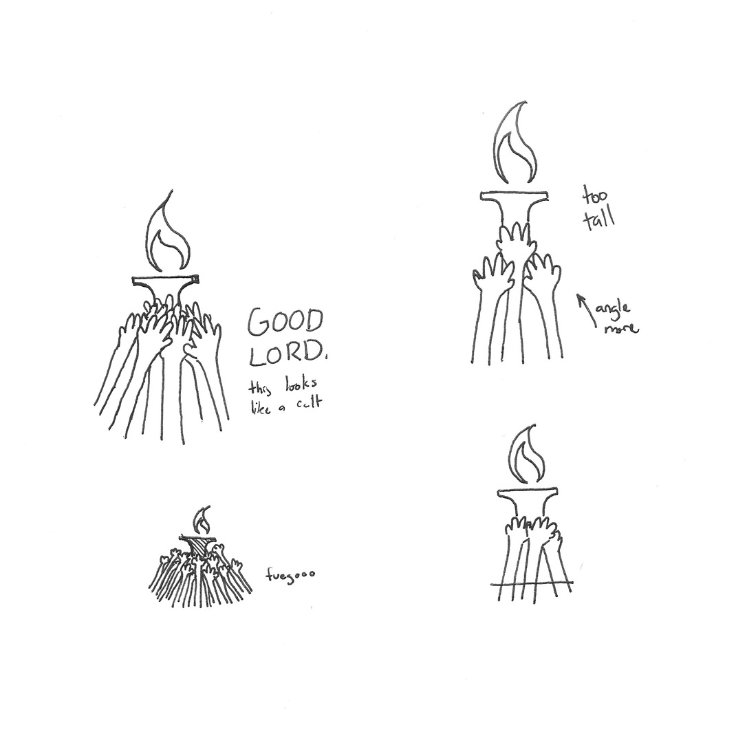
From there, I remembered the Governor's School Alumni Association's slogan of "keep the torch burning", referencing the torch in the center of Governor's School's original logoform. Since torches are a graspable object and carrying a torch is (thanks to the Olympics) widely representative of continuing tradition, I thought this approach was worth a shot. (GS is turning 50 this year, consequently)
I chose to frame with either a square or circle, representing stability and continuity, respectively. Multiple hands remarked to a more impersonal, grassroots approach, breaking the space and drawing the viewer in. I wanted to create something that showed strength and community.


No comments:
Post a Comment